
It's all in the details
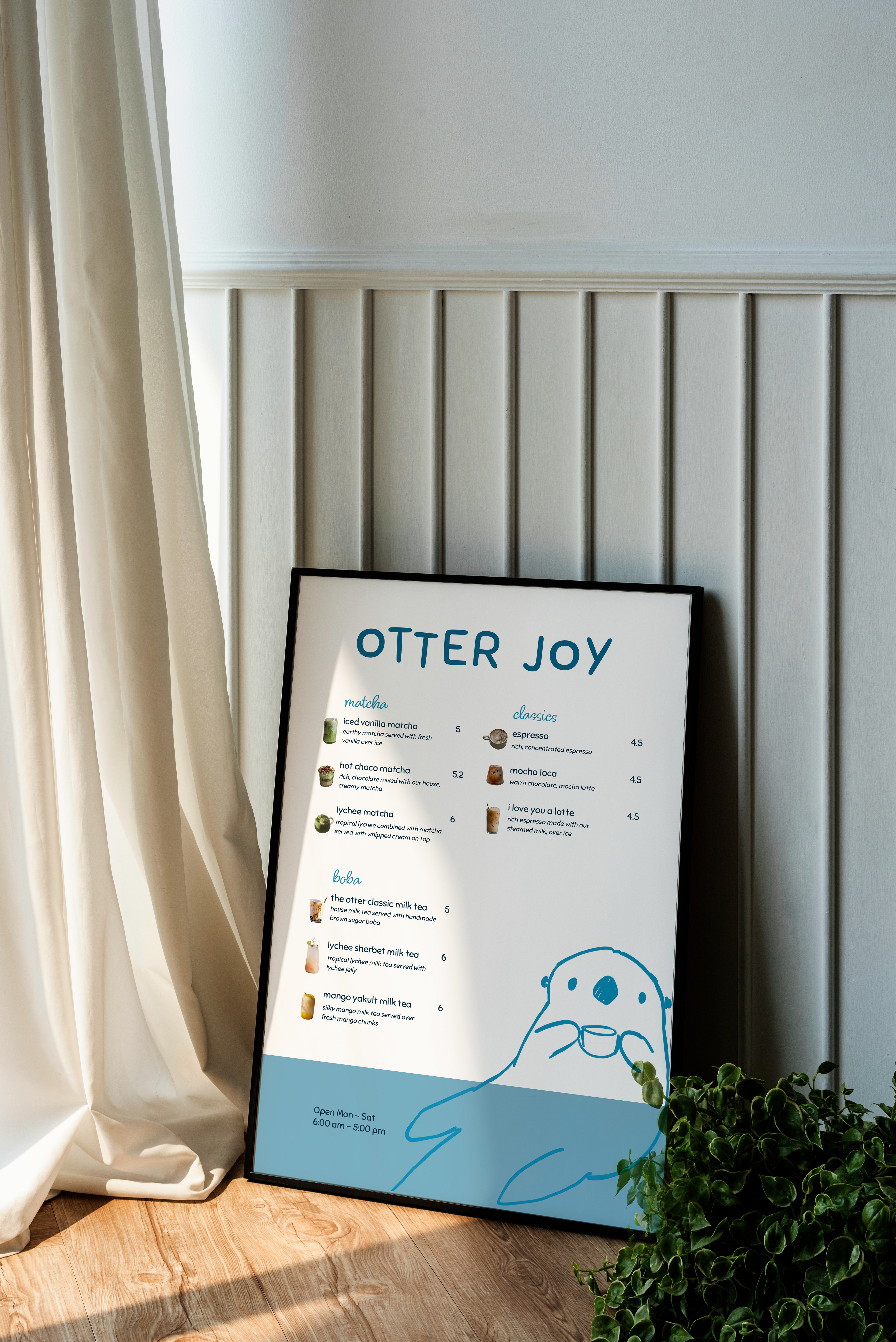
This design was for my Graphic Design class. The prompt required a menu for a coffee shop, so I designed a menu for an otter coffee shop.
"Otter Joy" is a play on words from the phrase "Utter Joy." It stems from the joy I feel whenever I see a sea otter. I centered it up top and scaled it's size, so that it would capture your attention first.
This was one of my favorite projects this spring. I was inspired by tropical animal cafes and Japanese cafes. Illustration is my major, so I drew an otter to add another element to the composition. Blue is a psychologically calm color, which I chose as my theme. I added a blue bar at the base of the menu. This was to add a contrasting element and to draw the eye down the menu. I love the script font for the subheads and the visual interest it adds. For each menu item, I chose drinks I would actually drink. I love boba, matcha, and hot choco.
Thanks for reading!