
It's all in the details
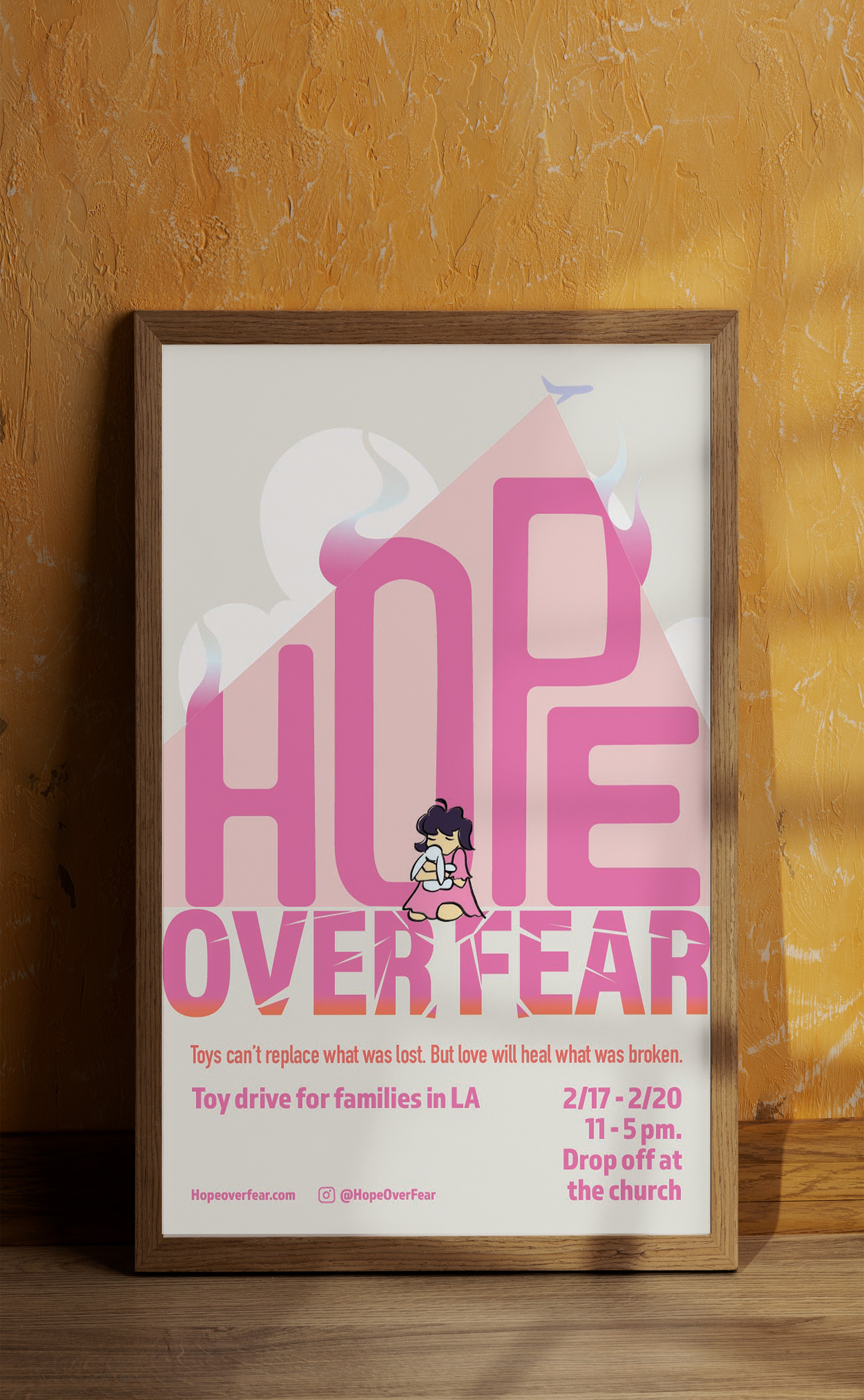
In my Graphic Design class, my final was a poster and social media project. The prompt was for a charity of my choice. I chose to center my theme on a toy drive for families in LA. Living in California, I know people in SoCal who have lost their businesses, houses, and churches to the fires. These kinds of tragedies feel hopeless sometimes. So I decided to highlight hope.
From the start of my design process, I knew I wanted a girl hugging her stuffed animal. When I was a child, I found security in my stuffed giraffe. Children connect with their stuffed animals, and I wanted that expressed in my poster.
My professor reminded me to expand on the idea of irreplaceability. This sparked my tagline "Toys can't replace what was lost. But love will heal what was broken." Toys can't replace every lost possession. But this charity is meant to cover the hurting with hope and love.
Design wise, I chose pink because it's the color of childlike innocence. When I researched images of the fires, I saw a ton of planes dropping fire retardant on the fires. Those planes were beacons of hope to me. So I played on that idea and had it dropping "hope" instead.
"Over Fear" was a fun experiment. I fractured the letters to express that fear can't persevere in the face of hope.
This project took over 4 weeks. I was frustrated towards the end because I felt at a loss on where to go. But with prayer, determination, and feedback from my professor I got through to the end.